Your WordPress website doesn’t display correctly on mobile, which means you are losing out on a good ranking on Google, failing to get a good number of organic traffic, new leads, and revenue through your website.
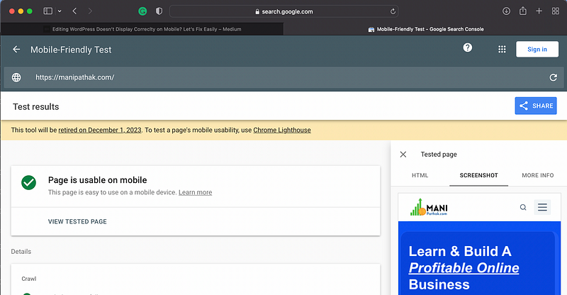
As you can see, my WordPress website (Manipathak.com) loads correctly on mobile devices, as I have demonstrated below using the Google tool.
However, you can also try this free tool from Google to check your website mobile friendliness.
Before I share the easiest ways to optimize your WordPress website for mobile devices, let’s talk about the easiest way to check if your WordPress doesn’t display correctly on mobile.
- Open your website on your Mobile and check.
- Use the inspect toll on chrome and safari browser or resize the desktop browser size to mobile size and refresh if you website loads correclty.
- Use free tool from Google to check your website mobile responsiveness.
Lately, Google itself made its search engine ready for mobile-first indexing, and 59.9% of searches on Google are made on mobile devices. Additionally, according to a daily blogger, around 83% of people in the US are mobile internet users.
I’m sure these numbers hold great value for you, and you are ready to make your WordPress website load correctly on mobile devices. No nonsense, this post will be dedicated to helping you make your WordPress blog website or any kind of website mobile responsive. If you need further assistance, I’m here to help.
There are three basic ways to do this, and I will cover each of them.
- Using WordPress website designing plugins
- With the AMP and Mobile first WP plugins
- Custom coding (CSS and JS).
For a beginner and a non-coder web designer, this method is not useful. That’s why I will focus on the first two methods that will quickly and easily help you fix your website for mobile devices.
Let’s dive in details:
Method #1: Using WordPress website page (Post) designing plugins:
Almost every WordPress website (pages or posts) is designed using drag-and-drop page building tools, which are called plugins and installed in the dashboard.
These page design plugins, such as Elementor, WPBakery, Beaver Builder, or Oryzen Builder, are used to design website pages and posts in WordPress, and they are typically free, with many of them already installed.
Let’s take the example of Elementor, the most popular page builder tool, to explain how you can optimize your website pages for mobile devices.
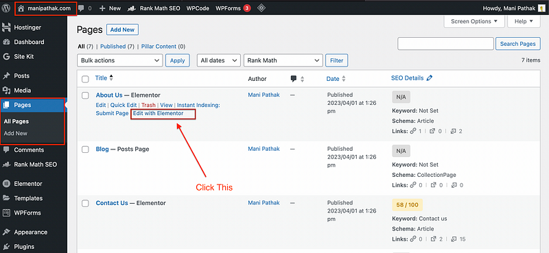
As you can see above in the image, you need to follow this step by step process to design your page design to make it fit for mobile devices.
- Login to your WordPress website dashboard.
- Go to page or posts section.
- Now select “Edit with Elementor” as shown above for the your desired page. I would suggest to start from the home page (Landing page).
- Now, it’s time to make it mobile responsive to load correctly on mobile devices.
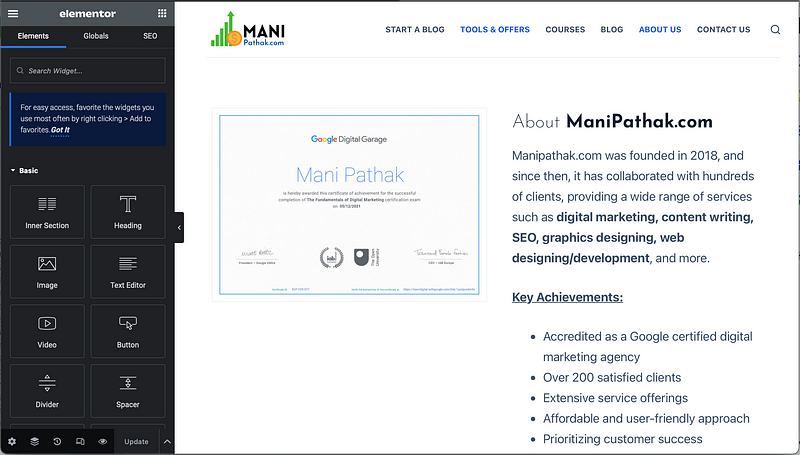
Now as you see here, your website web-page will open like this only in Elementor page editor.
By default, this is meant to show you desktop version to edit.
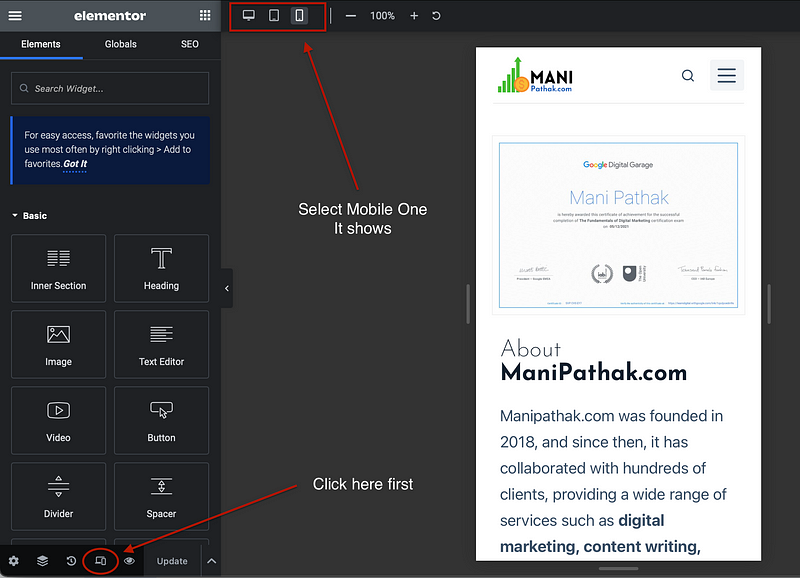
5. Great, Now you need to click on the bottom devices icon as shown below and it will open devices selection icons at the top. Select mobile from there as shown in the above image.
6. Now following the Elementor page building (designing) skills, re-design the mobile version of the web page and your WordPress will Display Correclty on Mobile.
Incase, you don’t know how to work on Elementor plugin, you can follow this free Elemetor page editor tutorial.
I really want to help you, that’s why I showed step by step guide to make your website mobile responsive and correcly.
👉 However, if you find it difficult or don’t have time to do it, hire me to help you make your website mobile-ready.
Let’s jump on the second ways that also works like wonders and helps you make your website load correctly on mobile.
Method #2: With the AMP and Mobile first WP plugins
Unlike the most efficient method I mentioned above, there are other ways that can help you turn your website into a mobile-responsive AMP (Accelerated Mobile Pages) version, making it look good and work properly on mobile devices.
In general, sometimes bloggers and web developers take the help of mobile-first AMP and other plugins to turn their websites into responsive versions.
Anyway, if you know nothing about WordPress plugins, they are just like apps for WordPress. We install plugins on your website to extend its functionality and features without coding.
Now, you can understand how we can install certain plugins that can help you turn your website into a mobile version, making it load easily and resolving your query ‘WordPress Doesn’t Display Correctly on Mobile’.
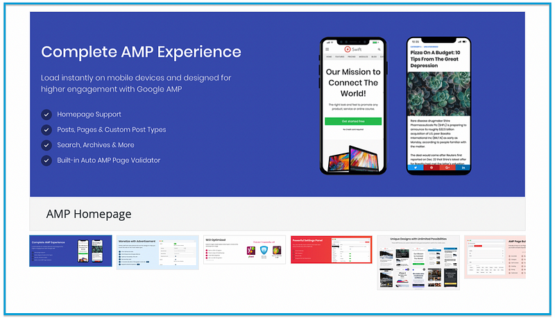
Some of the plugins, you can install if your WordPress doesn’t display correctly on Mobile:
- AMP for WP — AMP for WP automatically adds Accelerated Mobile Pages (Google AMP Project) functionality to your WordPress site. AMP makes your website faster, optimized for mobile devices, responsive, and offers various features for mobile visitors
- WPtouch — For mobile users of your website, WPtouch is a mobile plugin for WordPress that effortlessly incorporates a simple and fashionable mobile theme. This Google-approved plugin quickly turns on a mobile-friendly version of your website, making sure it passes the Google Mobile test and keeps your SEO rankings intact without suffering from a drop in mobile friendliness.
- AMP WP — This is another AMP plugin that can make your website faster and comes with a ton of features to make your website the best fit for mobile users. Using this plugin, you can even use your desired template for the mobile version, in addition to the default theme, and optimize mobile pages for mobile users. It’s not limited to mobile website creation and optimization alone, but it also helps you control Google AdSense ads on your website, page design, loading time, mobile menu, and much more, which you can learn about on the official page here.
An awesome post published on the Search Engine Journal blog about the 8 best WordPress plugins to make your website mobile-friendly can certainly be a good read and help you edit and design various elements of your website’s mobile version.
Writing and publishing high-quality and helpful content, as required by Google’s helpful content updates, helps us reach people like you who need to understand and fix why your WordPress Doesn’t Display Correctly on Mobile.
But it takes a lot of time. I don’t want you to skip or misunderstand. Kindly read the entire post and share your feedback at the bottom (in the comments) and give the post at least 50 claps.
Great, It’s time for the third method.
I’m sure, some of you are good at WordPress coding ( HTML, CSS, PHP and JS) and you will love this method.
Method #3 — Custom coding (CSS and JS)
Unlike the no code methods, this is not meant for everyone and you may break your website if you know nothing about coding.
In this method, you can simply edit your WordPress website theme and files, CSS and JS of web pages to make your website mobile optimsied.
Lately, I notices a few no-code plugins that can assist if you know little bit of coding and want to try but I would say, they other easy method instead.
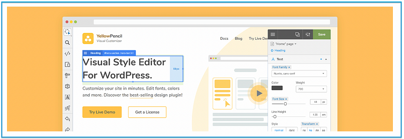
- Visual CSS Style Editor — You can use this plugin to change any theme or page without knowing any code. To begin altering an element visually, click on it. Change a lot of things, like the fonts, colours, sizes, and placements. With more than 60 style properties, you may fully customise the look and feel of your website.
Remember, this plugin is just an add-on for CSS changes and designing with limited coding skills.
However, it will not make your website fully mobile-ready. You need to have better PHP and other coding skills to work on themes, plugins, and designs if you follow this method.
Let’s answer some commonly asked questions to solve your problem and easy to follow for best results.
FAQs (Frequently Asked Questions):
Here are some commonly asked questions for you to clarify and help you make your website mobile responsive.
Q1. Which method is best for you?
Each method I have discussed above to display your WordPress website correctly on mobile has its own importance and suitability for different kinds of users based on their skills, time availability, and freedom to make changes.
In general, the first method is the most effective and a no-code method to build a great mobile-responsive website version with the help of plugins like Elementor, but it takes time and good drag-and-drop designing skills. It may be challenging for beginners, which is why the second method is more accessible and faster for converting your website into a mobile-responsive version. However, it may not be as perfect as the first method, where you have full control over design and view.
Similarly, the third method is time-consuming and more suitable for developers only. If you don’t know how to code and can’t edit web pages using page builders like Elementor for the mobile version, the second method is the best choice for you.
However, you can also hire me to make your website responsive and well-optimized for mobile devices.
Q2. What is my preferred choice to make your website mobile responsive?
I would say, Elementor visual build method is the best and most accurate method to make your website ready for mobile devices without compromising with quality and taking the risk of bug fixes as happens when you code yourself.
Q3. How do I make my WordPress site look good on mobile?
To make your WordPress site mobile-friendly, you need to follow the detailed guide, I have shared above.
Here is the summary:
- Understand why responsive web design is important.
- Take the Google Mobile-Friendly Test.
- Use a responsive WordPress theme (or create your own)
- Consider mobile-friendly WordPress plugins.
- Use mobile-friendly opt-ins.
- Think in terms of responsive media.
Q4. Why does my WordPress site look different on mobile?
Installing a responsive (Layout) WordPress theme on your website ensures that it functions and is optimised for mobile devices such as iPhones, iPads, Android phones, and other tablets. The right or left sidebars of the desktop version show below the posts on mobile so that there is maximum reading area available.
Not all themes, meanwhile, are optimised for mobile devices or mobile-responsive. Because of this, you might need to use visual builder plugins or other techniques (Shared above) to make your WordPress pages and posts responsive without altering the theme.
The Bottom line:
In a nutshell, nearly 60% of searches on Google are made on mobile devices such as iPhones, iPads, or Android smartphones. It’s an absolute necessity to optimize your website for mobile to reach a massive audience effectively and grow your online or offline business.
A poor website design or performance on mobile will simply erode customer trust, lead counts on your website, and brand value.
Lately, Google itself has adopted mobile-first indexing, illustrating the importance of an optimized mobile version of your website.
For your reference, I have shared the links to my website’s home page below. If you open it on your mobile device, it will resize and adapt to the mobile screen for better performance.
Frankly speaking, it’s truly important, which is why I invested hours of hard work to publish this post addressing “WordPress Doesn’t Display Correctly on Mobile” and shared all possible solutions.
Make your website mobile-responsive with an appealing design and fast loading times, and you’ll experience a more than 30% increase in website conversion, traffic, and trust.
If you want to learn more or stay updated with the latest trends, subscribe to my mailing list.
★★ Remember, sharing is caring, so don’t forget to help me reach more people.
Leaving 50 claps and a comment can add even more value for everyone.
👉 Subscribe | My website | Twitter
Thank you for your valuable time.


